Same $1M, different decade: sequence of returns risk in 127 cities
This article reflects data from its publish date. Our city pages always show the latest quarterly figures - check there before making plans.
Let’s say you have $1,000,000 and put it in a standard 75/25 split of stocks and bonds for a 30 year retirement. We’ll assume all variables are held constant except two: 1) the year you stop working and 2) where you retire. At PortfolioAtlas we ran that experiment with our own backtest engine through historical stock market data - 123 start years from 1871 to 1993, on a dataset that runs through 2022 - and calculated the FIRE-tier cost of living in all of our cities. Those two inputs alone determine whether you end up broke after 30 years or with multiples on your wealth.
Our model keeps the market constant wherever you are in the world, so retiring in Singapore in 1966 means the 1966 market sequence. We cover PortfolioAtlas’ methodology at the end.
Wondering the worst year to retire? It’s probably not the one you expect.
The worst year to retire was 1966, not 1929
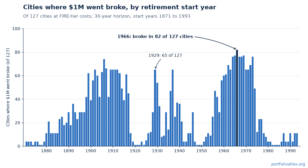
Most guesses land on 1929, however the backtest puts it in 17th place among the worst start years since 1871. A $1M retirement starting in 1929 went broke in 65 of 127 of our cities at FIRE-tier costs. Starting in 1966 it went broke in 82 of 127, which is 65% of the map.
Retiring on $1M in 1966 went broke in 82 of PortfolioAtlas’s 127 cities. 1929? Only 65, and it ranks 17th among the worst start years since 1871.
Why is a stagnant decade worse than a crash? Crashes recover and inflation compounds. Through the early years of the Depression prices actually fell, so a 1929 retiree’s withdrawals shrank in nominal terms while the portfolio recovered. A 1966 retiree faced the opposite: a decade and a half of high inflation where every withdrawal came out larger than the last, however the market went nowhere in real terms so there was no rebound to wait for.
The top of the worst-start list is all inflation years. In our data, every start year from 1964 through 1969, plus 1973 broke at least 76 of the 127 cities, with 1966 the worst of them at 82.
1966 broke the most cities, however it isn’t the fastest killer in the record. That’s 1916 - the WWI inflation spike - which broke a New York retirement in just 6 years, by 1922. Below we follow the same 1966 retirement in two different cities.
Same $1M, same 1966: Singapore vs Chiang Mai
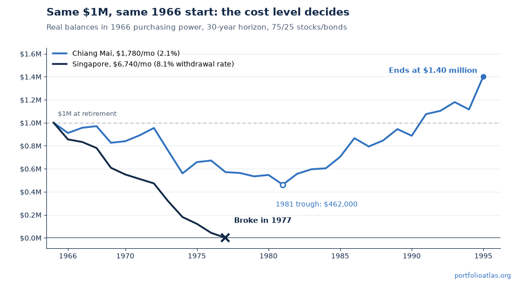
Let’s follow two $1,000,000 portfolios that both retire in 1966. One retires to Singapore at $6,740 a month - an 8.1% withdrawal rate - and the other to Chiang Mai at $1,780 a month, a 2.1% rate. Both run through the same engine with the same returns and the same inflation, so the only variable is how much leaves the account each month.
Quick aside - all the balances below are in 1966 purchasing power, so you can compare them directly against the $1,000,000 you started with.
Singapore starts out fine. There’s no crash for years, however the balance falls anyway - the market goes sideways while inflation pushes each withdrawal higher, and an 8.1% starting rate leaves no cushion for either. By the time the crash finally arrives, the balance has already roughly halved in real terms.
Then 1973 and 1974 do the rest. The account ends 1973 at $317,530 and 1974 at $180,362. By the end of 1976 there’s $42,880 left, and in 1977 there isn’t enough to fund the year at all. That’s 11 years funded out of a 30 year retirement.
Back to 1966… this time you’re in Chiang Mai. The balance falls comparably hard, bottoming at $462,000 in 1981 - down 54% from the start - and watching that account you’d have every reason to think this plan was failing too. The difference is the 2.1% withdrawal rate: it’s small enough that the portfolio keeps compounding through the drawdown, and when the recovery comes there’s still real principal for it to work on. Chiang Mai finishes the full 30 years at $1.40 million in real terms, while the account statement itself - written in the inflated dollars of the day - reads $6.81 million.
Same $1M, same 1966 start: Singapore was broke by 1977. Chiang Mai finished all 30 years with $1.40 million of 1966 purchasing power.
And Singapore’s own record makes the same point in reverse - its best start year, 1982, ended 30 years later at 2.3x the starting balance in real terms. Same city, different decade, opposite outcome.
Failure rates by start decade
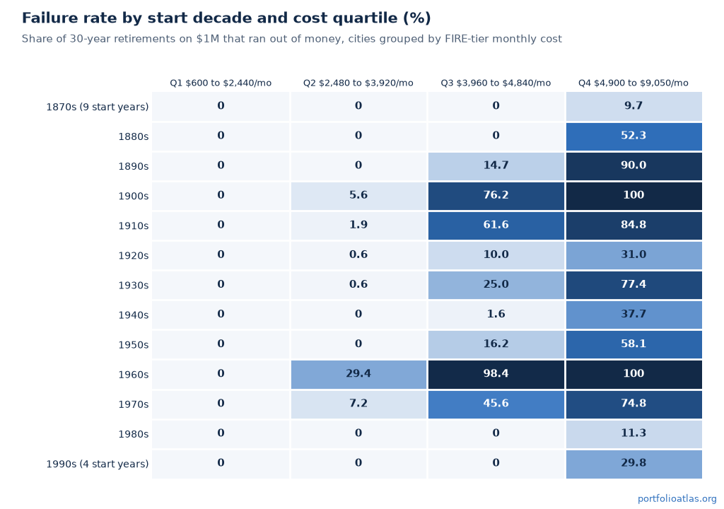
We also looked at this by decade. We grouped the 123 start years into decades and split the 127 cities into four cost quartiles, running from $600 to $2,440 a month at the cheap end to $4,900 to $9,050 at the top.
In the 1960s the priciest quartile failed 100% of its starts. The next quartile down failed 98.4%. The second-cheapest failed 29.4%, and the cheapest failed 0%. The priciest quartile also failed every start in the 1900s (100%), and its best complete decade - the 1980s - still failed 11.3% of the time. The partial 1870s bucket, nine start years, sits at 9.7%.
New York is the far end of the scale. FIRE-tier costs there are $9,050 a month - a 10.9% withdrawal rate on $1M - and it failed 123 of 123 start years. The two longest runs began in 1921 and 1982. A $1M portfolio has never survived 30 years of FIRE-tier New York costs in 152 years of market history. Even the 1982 cohort died in 2011, one year short.
One caveat before you read too much into the table: overlapping 30 year windows aren’t independent samples, so treat every rate in this section as a historical frequency rather than a probability. And if you’d rather stress test two specific cities than a whole quartile, you can put them side by side.
Cheap cities don’t compress the luck, they lift the floor
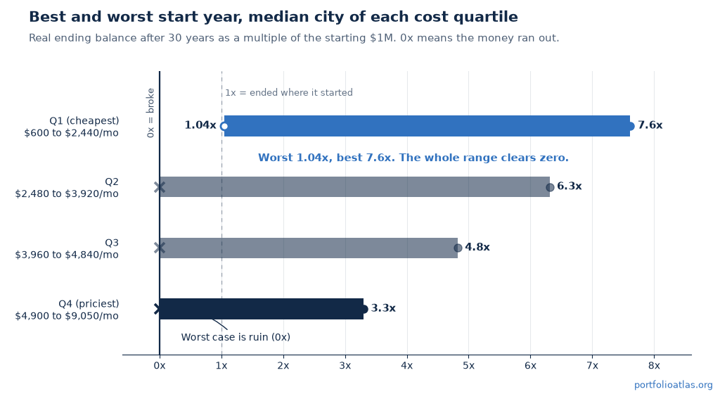
You might expect low costs to make the start year matter less. Look at the median city in the cheapest quartile: retire at the worst time in the record and 30 years later you hold 1.04x what you started with, in real terms. Retire at the best time and you hold 7.6x. That’s a 6.6x gap, and the only difference between those two retirees is the year they stopped working. The priciest quartile shows a smaller gap of 3.3x, however that smaller number isn’t good news. So many of its unlucky cohorts hit zero, and a broke portfolio can’t fall any further, so the bottom of its range piles up at the floor.
Cheap cities don’t shrink retirement luck. The gap between best and worst start year is wider there, 6.6x vs 3.3x of starting wealth. They just move the whole range above zero.
In the cheapest quarter of cities, no start year since 1871 has ever depleted a $1M portfolio at FIRE-tier costs over 30 years. The median cheap city’s worst-ever cohort still ended richer than it started (1.04x real). Across the whole quartile, 0 of 3,936 city-cohorts failed.
The lowest floor in the quartile belongs to Marrakech, whose worst cohort ended at 0.65x of starting wealth - painful, but still not ruin. The priciest quartile failed 60.0% of its cohorts and its worst case ran out of money in 6 years. (Chiang Mai’s own best start is 1877, at 7.9x; sequences that old are hard to relate to, so don’t anchor on them.)
So sequence of returns risk doesn’t disappear in a cheap city - it changes what’s at stake. Instead of asking whether your money survives the 30 years, you’re asking how much you leave behind. You can browse the cheapest quartile by country if that trade appeals to you.
The 1966 gatekeeper and the ruin boundary
Across the whole study, 82 of 127 cities have at least one failed start year and 45 of 127 have none. The first group is exactly the 82 that broke in 1966 - every city that has ever failed any start year also fails a 1966 start, and no city clears 1966 and then fails somewhere else in the record.
That makes 1966 a handy screening test: if your city survives a 1966 start, it survives every start year since 1871.
The boundary between the two groups is narrow. Nairobi costs $2,890 a month - a 3.5% withdrawal rate on $1M - and has never failed a start year. Tokyo costs $3,060 a month at 3.7% and has failed 1 of 123 start years. The one failure is 1966: that cohort made it 29 years and went broke in 1995, in year 30 of a 30 year plan. For $1M over 30 years, the entire historical ruin boundary sits in the gap between those two monthly budgets.
What this means for a $1M plan
You don’t get to pick your start year. Nobody who retired in 1966 knew they’d drawn the worst cohort in the record, and nobody who retired to Singapore in 1982 knew they’d drawn its best.
What you do control is the spending level, and that decides what a bad draw costs you - a smaller estate or an empty account. The median PortfolioAtlas city runs $3,920 a month at the FIRE tier, which is a 4.7% withdrawal rate on $1M. That’s just above the conventional 4% “safe” withdrawal rate, which is why the start year matters so much at this portfolio size.
The verdict on every city page is this same backtest run at your portfolio, your horizon, and your confidence setting. See which cities $1M clears, or start with our roundup of the best cities to retire on $1M if you’d rather begin from a shortlist.
Methodology and caveats
Let’s take a look at where these numbers come from. We gave every city the same retiree: $1,000,000, invested 75/25 in stocks and bonds, withdrawing that city’s FIRE-tier cost of living, inflation-adjusted, over 30 years. We ran 123 start years, 1871 through 1993, for all 127 cities on our own frozen backtest engine and the Shiller US dataset (1871 to 2022) - the same engine behind the verdict on every city page.
Why $1,000,000? It puts the middle of the dataset right on the edge. Our required-portfolio solver says the median-cost city - Fargo at $47,040 a year - needs $1,029,000 to clear the default Balanced confidence target over 30 years, so a round $1,000,000 lands the median city near the retire/not-yet boundary, which is where start-year contrast is largest. As an outside anchor, the classic 4% case ($1M with a 4% starting withdrawal) succeeds in 96.7% of start years here, in line with Trinity-style results.
Three caveats… First, the engine applies US market returns and US CPI to every city; geography enters only through the spending level, and we didn’t model local markets or local inflation. Second, city costs are today’s FIRE-tier costs on a single-adult basis, and both they and the $1,000,000 stay in today’s dollars. A 1966 start doesn’t send your money back to 1966 - it replays the sequence of returns and inflation that followed 1966 as if it started today. Only the order of good and bad years matters, never the old price level. Third, overlapping 30-year windows aren’t independent samples; every rate in this post describes the historical record, not a probability.
Withdrawal-strategy variations such as guardrails and bond tents, currency effects, and taxes are out of scope here and queued as future work.
Find Your FIRE Destination
Use our tools to discover where your portfolio goes the furthest.